Exploring the Impact of Color Scale in Exposure Photography
When it comes to photography, exposure is the backbone of a captivating image. It’s fascinating how something as seemingly simple as lighting can redefine the scope and feel of a photograph. Yet, one aspect that often goes unnoticed is the usage of color scale, a tool that not only enhances the visual appeal but also evokes emotions, stirring the viewer’s imagination.
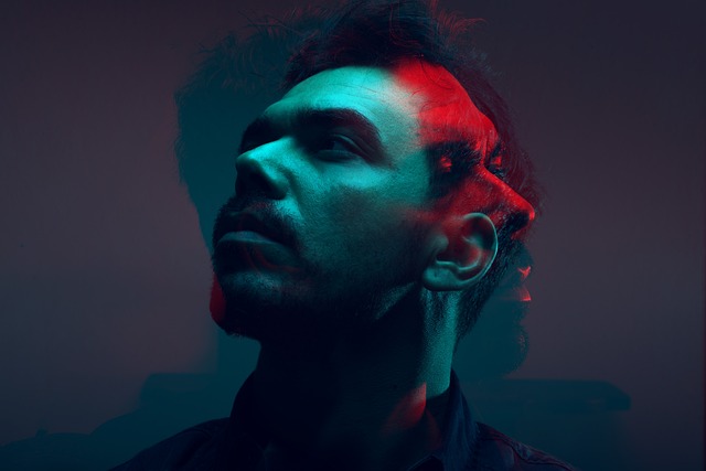
The Role of Color Scale in Setting the Mood
Think about a sunrise. The gentle hues of orange and yellow not only brighten the scene but also induce feelings of hope and renewal. In contrast, deep shadows intertwined with cool blues and greens can evoke feelings of mystery or melancholy. Photographers wield the color scale like a painter leveraging their palette, carefully choosing colors to connect with the viewer on an emotional level.
Exposure and Color Harmony
Achieving the perfect exposure is crucial, but color harmony is equally important. A well-balanced color scale can make or break an image. When colors are well-matched, they create unity in the photograph, allowing the subject to stand out while engaging the audience. Conversely, mismatched colors can lead to a chaotic, jarring experience, making it harder for viewers to process what they’re seeing.
Emphasizing Textures Through Color
Using the color scale effectively can also highlight textures within an image. For example, vibrant colors against muted backgrounds draw attention to intricate details, like the delicate weave of a fabric or the subtle patterns of a leaf. This interplay between color and texture invites the viewer to look closer, engaging them with the photograph’s story.
Fine-Tuning Exposure with Color Adjustments
In post-processing, color adjustments can enhance the overall exposure without altering the integrity of the photograph. By fine-tuning the color scale, photographers can manipulate warmth and coolness, changing the narrative behind their images. A slight tweak in color balance can evoke a different time of day, altering the context and mood of the moment captured.
Creating a Sense of Depth
Color can create an illusion of depth—a fundamental aspect of stunning photographs. Warm colors can bring subjects forward, while cooler shades can push them back into the image, enhancing perspective. Thoughtful use of the color scale can transform a flat scene into a dynamic, multi-dimensional composition, allowing the viewer to journey into the frame.
Pushing Boundaries with the Color Scale
Advanced photographers often experiment with unconventional color scales to redefine traditional concepts of exposure. This brave approach might mean overexposing certain aspects or muted tones for dramatic yet harmonious results. Embracing such risks can lead to innovative images that challenge the norms, inviting conversations about creativity in photography.
The Emotional Power of Color
Ultimately, the color scale in exposure photography is more than mere aesthetics—it is about communication. The choice of colors reflects the photographer’s intention, whether it’s to inspire joy, provoke thought, or highlight beauty. These choices resonate deeply with viewers, making the image not just seen but felt.